
How to Choose Wall Art Colors for Your Home Decor
Choosing wall art is more than just finding a pretty print—it’s about selecting colors that elevate your space, complement your decor, and create the mood you want. Whether you're decorating a new home or refreshing a single room, choosing the right wall art colors can completely transform the atmosphere.
Here’s a simple, designer-approved guide to help you choose the perfect wall art colors for your home.
1. Start With Your Room’s Existing Color Palette
Before browsing art, take note of your room’s dominant colors:
Wall color
Furniture tones
Floor color
Textiles (rugs, curtains, throw pillows)
Designer tip:
Choose wall art that includes one or two colors already present in your room. This creates harmony and helps your decor feel intentional and pulled-together.
2. Decide the Mood You Want the Room to Have
Color affects emotion more than any other design element. Think about the mood you're aiming for:
Calm + relaxing: soft blues, greens, muted neutrals
Warm + cozy: terracotta, rust, mustard, browns
Bold + energetic: red, orange, bright yellow
Elegant + modern: black, white, metallics, cool grays
Your wall art should support—rather than fight—the mood you want the space to evoke.
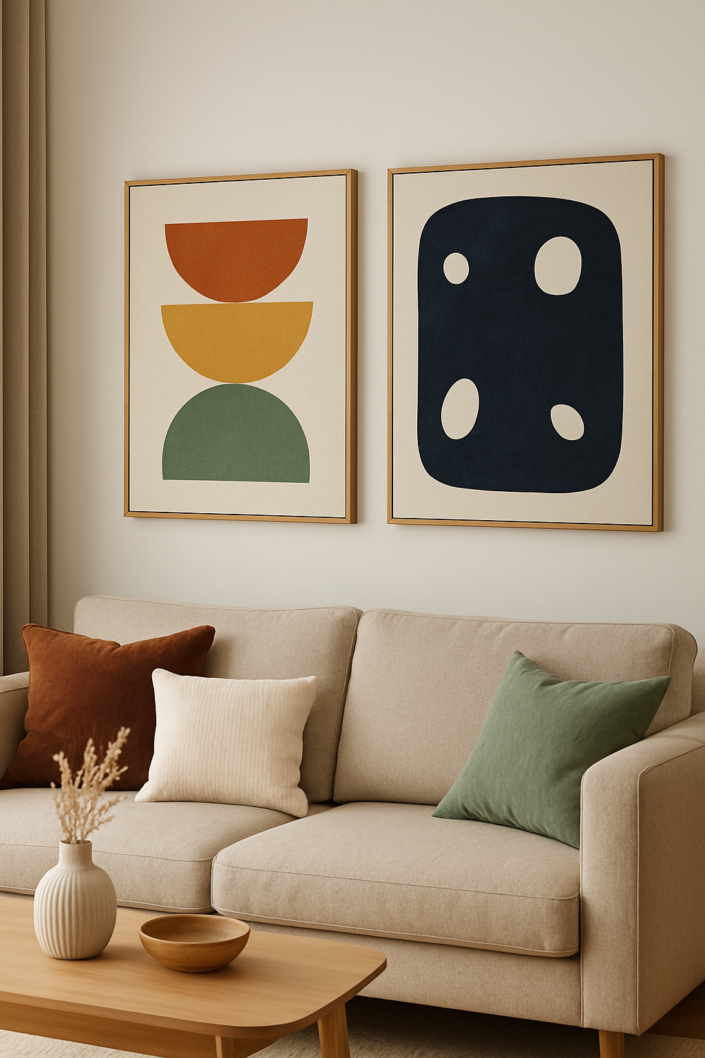
3. Pick Art That Contrasts (Not Matches) Your Wall Color
Matching your wall color exactly can make art disappear. Instead, choose colors that stand out while still complementing your palette.
Examples:
White walls → bold or dark art pops beautifully
Navy walls → warm tones like gold, beige, or blush add softness
Beige walls → deep greens, blacks, and rich browns create depth
Contrast creates visual interest and helps the artwork become a focal point.
4. Use the 60-30-10 Rule for Balanced Colors
Interior designers love this simple formula:
60% main room color
30% secondary color
10% accent color
Your wall art can either introduce the 10% accent color or reinforce the 30% secondary color. This ensures the art feels cohesive within your decor.
5. Consider the Room’s Function
Different rooms call for different color vibes:
Living room: versatile colors—neutral, warm, or bold depending on your theme
Bedroom: soothing tones like lavender, sage, blues, or neutrals
Office: energizing hues like green (focus), yellow (creativity), or crisp black-and-white
Dining room: warm tones that feel inviting and enhance conversation
Let the room’s purpose guide your color choices.
6. Don’t Be Afraid to Introduce a New Accent Color
If your space feels flat, wall art is the easiest place to add a fresh pop of color.
A single print or a gallery wall can bring in a new hue—sage green, blush, navy, burnt orange—that ties the entire space together.
7. Test Before You Commit
Before buying:
Hold up color swatches
Use your phone to preview art on your wall
Print a small proof if possible
Good online art shops often include “preview in room” tools or mockups to help you visualize the colors.
Final Thoughts
Choosing wall art colors isn’t about rules—it’s about creating a space that reflects your style and feels good to live in. Start with your existing palette, consider the mood, play with contrast, and trust your instincts. The right colors can turn any blank wall into a stunning design moment.